Superpresence - Designing Landing Pages for Sceptical Buyers
Designing Landing Pages for Sceptical Buyers
Buyers arrive on new websites with their guard up because they expect hidden costs and exaggerated claims. A landing page must disarm this scepticism immediately to keep visitors reading.
Building trust forms the foundation of every online transaction. Visitors will only evaluate a product after they feel confident in the business behind it.
Hiring a professional web design agency helps build this foundation because experienced teams build websites specifically to answer buyer doubts.
Establish proof before making promises
Visitors look for evidence of past success before they believe future claims. Put your track record near the top of the page so they see it instantly. A local shop can show photos of real customers using their items. A consulting firm should display specific outcomes from past projects.
When claims sound vague, buyers dismiss them because they read them everywhere. They respond to concrete examples of your work. So, put reviews right next to the main claims instead of burying testimonials on a separate page.
Immediate proof keeps them moving down the page. A buyer reading about a specific service needs to see a positive review of that exact offering at the same time. It shows that other people have already taken the risk and succeeded.
Use design to answer your prospects questions and objections
Cautious shoppers leave a page when they cannot find crucial details like price or delivery times. Many businesses hide their pricing behind contact forms. This approach frustrates visitors and drives them away.
Displaying a starting price or a clear range builds immediate trust. The buyer knows exactly what to expect. Clear timelines also reduce hesitation by telling the visitor what happens after they commit.
A local service business can list the exact steps from booking to completion. When a landing page maps out the entire process, the buyer feels safe taking the first step. They don’t have to guess how the transaction will work.
Replace vague graphics with concrete visuals
Generic illustrations create doubt about what a company does. Visuals that are "real" but don't look like they belong to the business create the same doubt. Photos, icons, and illustrations should be read as one system.
Stock photos and obviously AI-generated graphics do the opposite: they make a page feel interchangeable, and buyers read that as a reason not to trust what's behind it. Matching visuals to the brand is part of what separates real web design services from an off-the-shelf build.
On-brand, cohesive visuals beat generic decoration. Contrast makes this clear:
Element | Weak approach | Trusted approach |
Hero image | Stock photo of a smiling team | Real photo of the actual product |
Feature list | Vague icons | Screenshots or real examples |
Outcomes | Abstract graphics | Concrete data or before-and-after photos |
Speak and write in the language of your buyers
A mismatched tone makes a business look careless or desperate. Read the room before writing the headlines. A financial planner needs a calm and respectful tone, but a fitness center can use energetic language.
For every industry, short and clear sentences work best while complex jargon confuses readers and creates suspicion. The words on the page must match the emotional state of the visitor to maintain their attention.
Explain the offering using plain words that a customer would use in normal conversation. Clear writing signals honest business practices. It proves the company has nothing to hide behind complicated terms.
Make it easy for buyers to get in touch
Complicated forms cause interested visitors to abandon the process entirely. Ask only for the details necessary to take the immediate next step, which means a newsletter sign-up needs only an email address.
While a quote request might need a few more details, asking for full physical addresses will lower completion rates. Keep the initial request small. Label buttons with clear actions.
Specific phrases like "Get a quote" or "Start reading" clarify the process. Words like "Submit" tell the user nothing about what happens next. The buyer should always know exactly what clicking a button will do.
This is what that looks like in practice, shown in a “book a call” setup:
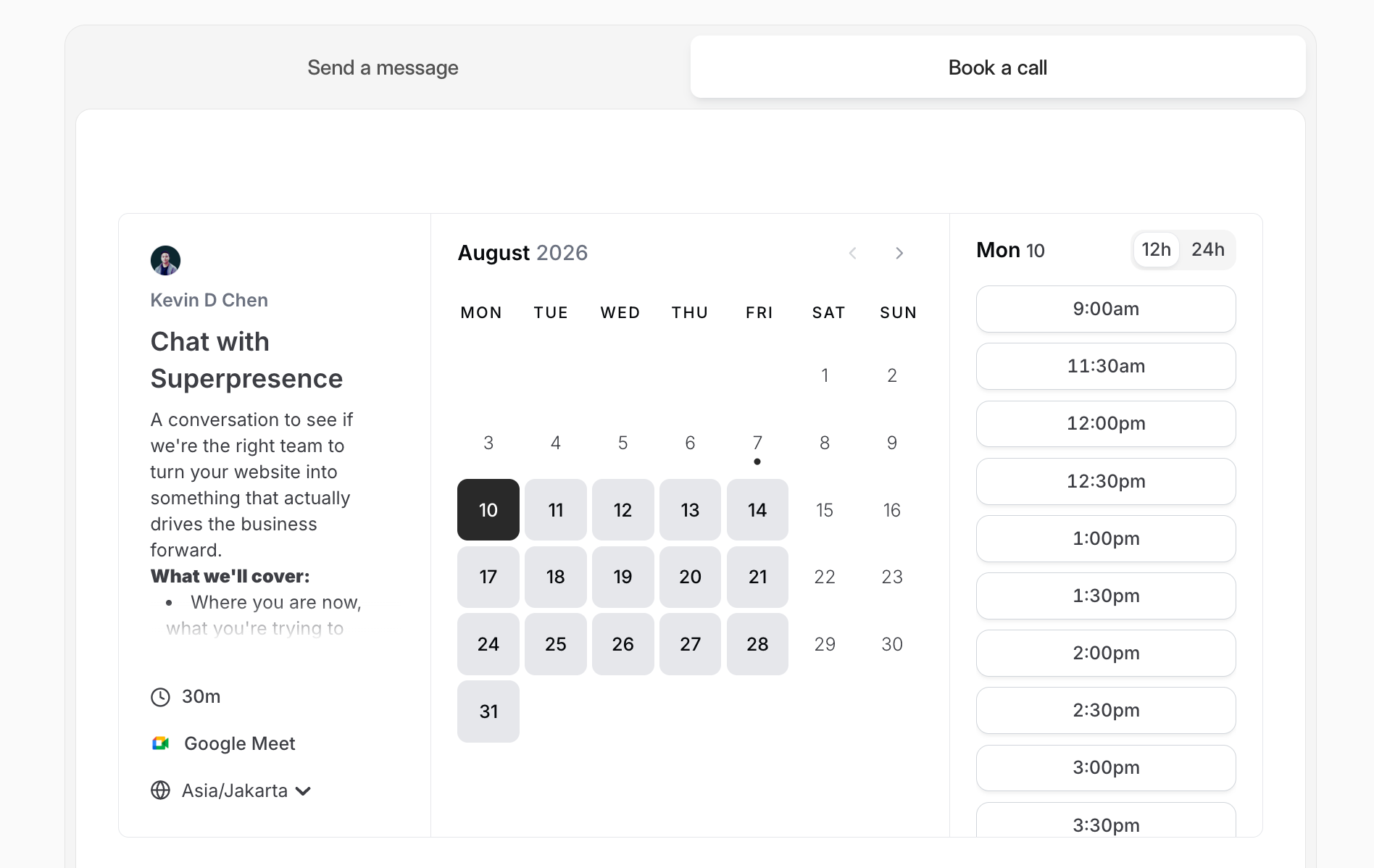
Pick a time slot and the meeting goes straight on the calendar.
Designing for decisions
Trust drives every commercial action on the internet. When landing pages answer doubts early, buyers feel safe moving forward. Clear structures and honest details turn sceptical visitors into confident customers. Build the page around transparency so you can earn that crucial first decision.
Superpresence is a B2B web design agency in Asia that builds websites to win business, not just to look nice. Start with a free site review, or get in touch at kelvin@superpresence.co.
Follow us on LinkedIn and Instagram for more.
Latest Chamber News

- Industry Focus