Superpresence - How to build a website international buyers take seriously
A buyer in Sydney or London opens your website, looks around, and leaves without contacting you. No enquiry arrives, and you never find out what went wrong. The same local Thai site convinces local visitors every week, and your work still wins referrals and relationships at home.
The usual conclusion is that the brand looks wrong, or that the English needs work. A Western buyer decides whether an overseas firm is safe to hire from how clear the messaging is. So the work is about structure and wording, and it rarely means changing your brand.
What is a Western buyer looking for?
A Western buyer opens your site to settle one question: can this firm deliver from the other side of the world? They can't visit your office or ask around the way a local buyer would, so layout, navigation and plain wording have to stand in as the evidence.
That's why the important things need to be spelled out rather than implied. A local visitor can work out what you do and whether you're any good from reputation alone, but a stranger has to read it on the page.
The homepage and the team page carry the most weight, because that's where a buyer is really reading the design and build as evidence about the people behind it.
Put your key pages one click away
Western buyers want your services, your prices and a way to contact you, sitting where every other site puts them. When those paths are hard to find, the site looks disorganised, and so does the firm. Four things should be obvious inside one click.
What you do
State the service in plain words, the way you'd explain it to someone outside the industry. A Western buyer is often relaying this to a boss or a procurement contact who will never read your site directly, so if they can't repeat it back in one sentence, it doesn't survive that conversation.
What it costs
Give a figure, or at least a range or a typical project size. This is the single biggest source of friction on the page: making someone ask before they can tell whether they can afford you is often the moment they leave for a competitor who already told them.
How to reach you
Contact details that actually work, easy to find, no contact form that disappears into a queue. This answers the most basic version of the reliability question: is this firm even real, and will anyone respond.
Who is on the team
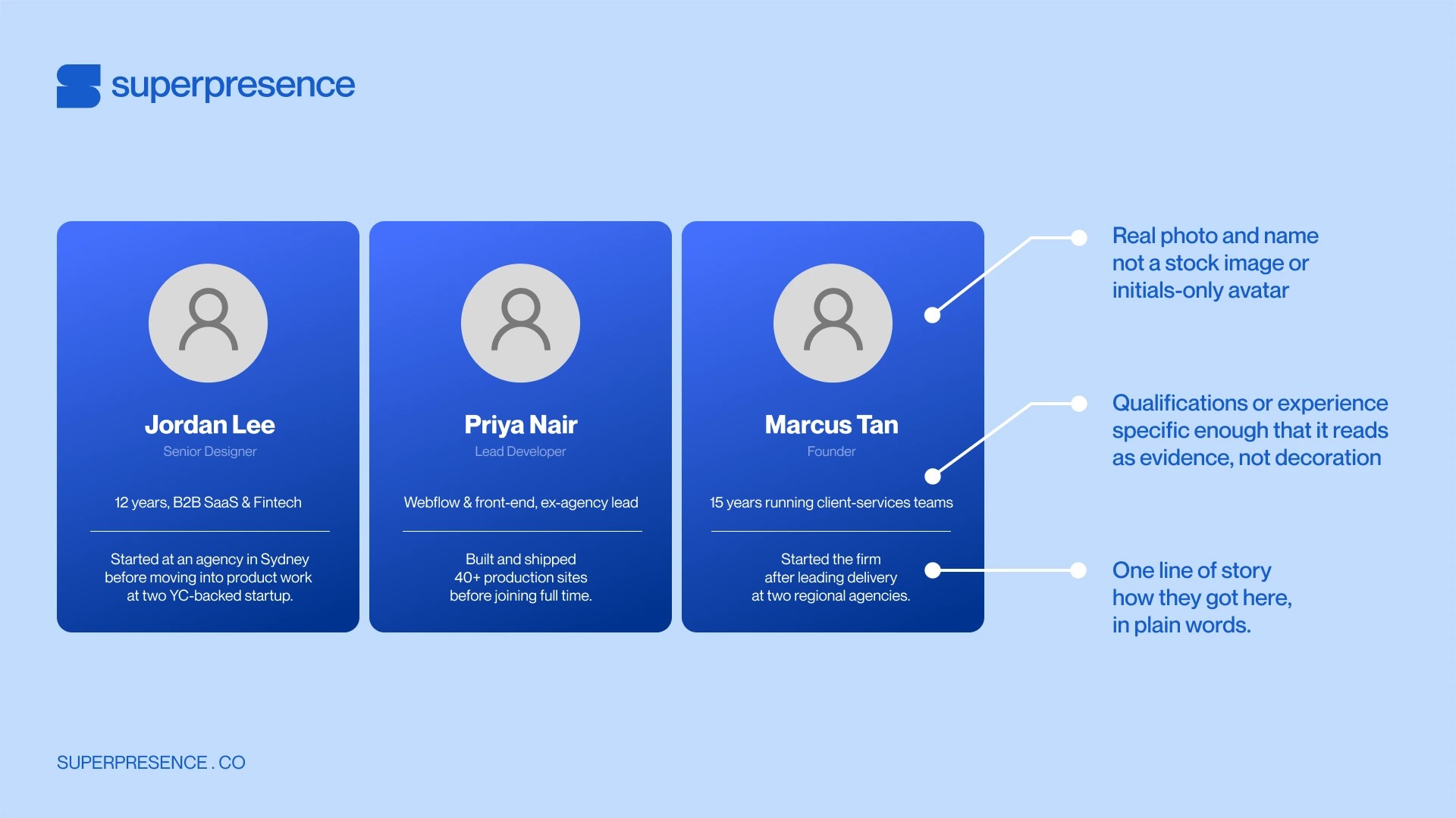
This is the section that carries the most weight, and the one worth building out properly rather than treating as a formality. Three things belong here:
- Real names and faces. Anonymous "our team" copy reads as a firm hiding behind the brand. A named person is someone a buyer can look up.
- Qualifications and experience. Credentials, past roles, or years in the discipline are what turn a face into a reason to trust the work, not just a photo.
- A line of brand story. Who you are, how long you've operated, and why the firm exists. Tenure and specificity are trust signals for a buyer who is deciding whether to hire someone they'll never physically meet.
You can run the test yourself. Give your site to someone who has never heard of you, and watch them hunt for your offer and your contact page.
Answer the risk question before the features
Your first screen has to do one thing: show that you can be trusted to deliver. Services and features are worth reading once that is settled.
Proof on the first screen is concrete: a real project with a result, named people, a clear scope, and a way to get in touch.
One real case story does more than any badge, because a buyer can check it. Describe a single project properly: what the client needed, what you did, and the results it achieved.
That usually means rebuilding the pages a buyer lands on first. Layout and messaging are most of what web design services change, and both should point at the proof.
Buyers aren't the only strangers reading that page before they ever speak to you. Investors and new users are running the same test, and your site needs to work for both.
Where to start
The hard part is reading your own site the way a stranger does. You know what every page is trying to say, so you read the meaning that is not written down.
The site that feels safest to a Western buyer is the one that answers the reliability question fastest, in the plainest layout. What loses the cold visitor is a site that implies what a stranger expects you to state.
If you want a professional opinion on your website, we offer a free site review. Our team builds websites for companies across Asia, and we always start with what the site needs to say.
Follow Superpresence on LinkedIn and Instagram for more.
Latest Chamber News

- Industry Focus